

Social Media Analytics: Understanding Your Audience
Color Psychology in Web Design
The psychology of color in web design is quite interesting and an essential part of designing an interactive online presence. It’s not just about style and people’s perception.
In this guide, we will look at some key underlying principles on color choice and application in web design so as to give an insight that the colors are not just visuals but vital tools of communication of the brand’s identity as well as enhancing user interactivity.
It is web designers’ knowledge of color psychology that will bridge the gap between visual appeal and psychologically compelling websites.
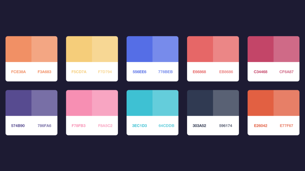
Basics for Web Designs.
A well-designed website often uses a dominant color to create a focal point. This color is complemented by secondary and accent colors to create depth and visual interest. This approach ensures that the website is not only aesthetically pleasing but also allows the user to engage with the content.
When applying these principles to website design, consider how they will reflect the website’s purpose and target audience. For example, red and orange are widely used in sauces to create excitement and attract attention. They are often well-suited for call-to-action buttons or promotional areas.
Cooler colors, especially blue, due to their calming effects, are ideal for professional or healthcare websites as they build on basic trust and tranquility. In addition, designers should also take color relationships into consideration.
A well-structured website should have a dominant color to provide significant focus, with secondary and accent colors to bring out depth and interest on the screen. With this type of design, you can greatly increase the professionalism of your website.
Hue is the color itself, saturation is how intense or pure the color is, and brightness is how light or dark the color appears.
Colors and Emotions: How They Drive User Engagement
The Science of Color Psychology
Color psychology examines how colors affect our emotions and behavior, a very important concept in web design. Various tones can evoke different psychological responses. For example, it is often stated that blue is associated with trust and calmness. Therefore, many corporate websites use this color.
Another example, red can be said to create a sense of urgency and excitement at the other end of the scale, representing elements of a call to action that must be responded to immediately or almost immediately.
Color Choices and Brand Perception
A website’s color choices will have a huge impact on how users feel about the brand. For example, green always symbolizes growth and health, thus making it perfect for wellness brands. Black, on the other hand, symbolizes luxury and sophistication and is always used by many high-end fashion brands.
The businesses may then continue perfecting the statement by exactly choosing a color palette that will strengthen their formulation of a brand identity and nurture an emotional bond to be felt with the audience.
Choosing the Right Colors for Your Web Design
Choosing the right color palette for a website is a combination of science and art. What is important is not just what appeals to the eye, but mostly what appeals to all the emotions of the brand or target audience.
Considering the target audience, the industry of the brand, and the emotional message that these colors should convey are important. Consideration should also be given to the use of contrasting colors that reflect the right personality, increase user engagement and for better readability.
Color Trends in Modern Web Design
1.Gradients and Duotones
The creation of gradients and duotones remains very vibrant in modern web design. Designers combine different colors in perfect harmony to create eye-catching backgrounds and components. Other image color variations are duotones, which are more striking colors that often contrast with each other.
2.Nature-Inspired Palettes
Today’s designers take their inspiration from nature and use earth tones and organic color palettes. Greens, browns and pale yellows are used, evoking memories of forests or mountains. Thus, it is aimed to create a feeling of peace and to establish a connection with nature. This phenomenon also includes the trend towards being sustainable and environmentally friendly.
3.Dark Mode Elegance
Dark mode is growing in popularity because it reduces eye strain, especially in low light conditions. Designers are experimenting with bold color combinations, using deep blues, charcoal grays and midnight blacks to develop impressive interfaces. Dark mode can be used not only as a trendy theme but also to attract the attention of other bright colors and items.
4.Embracing Minimalism with Neutrals
Minimalism has dominated the web design world in recent years, and neutral colors have become the favorite choice of various professionals. Tones such as light grey, which give a neat but stylish appearance, also provide a peaceful ambience that makes the rest of the elements stand out. This theme follows simple and clear purpose which improves users’ focus while browsing.
5.Going Bold with Vibrant Hues
On the other hand, there are some websites that subscribe to bold and vibrant color schemes in an attempt to generate focused attention and express their creativity. Electric blues and energetic yellows are used deliberately to highlight selected objects. Such vibrant color schemes can support the desired dynamic user interface.
So we hope the information we have listed in this blog will be helpful to your website.
If you would like to get more web design help for your website: